Zara Website Critic
Overview
Zara, a Spanish clothing store started in 1975, is now an international company with 1,751 stores. In every major city, customers can find a Zara store selling women’s, men’s and children’s clothing. Even though this worldwide company is thriving in a retail clothing market, their online presence is truly lacking with both a low-quality website and app.
Through this case study, I am looking at Zara’s website to find solutions to make it more competitive in the growing US online retail market.
This case study is for my personal doing. I have no affiliation with Zara and am not being paid by Zara for my findings.
Zara’s Business Model Breakdown
Core values: beauty, clarity, functionality and sustainability
Short turnover time: has a timeline of two weeks from designing to having clothing in store
Lower quantities: creates artificial scarcity causing the item to become more valuable
More styles: Rather than producing more quantities per style, Zara produces more styles, roughly 12,000 a year
“Zara excels by pulling customers into the brand, unlike its closest competitor H&M, which remains fixed on pushing its brand and product out to the customer”
— Pamela N. Danziger, Senior Contributor at Forbes
User Research
Zara’s Target Audience
Young fashion-forward, trend following customers who are looking for a deal or inexpensive alternative to high fashion.
Survey
I created a survey asking Zara customers their shopping trends, success of purchasing clothing and the differences of shopping in-store and online.
The survey was sent out to both men and women living in the United States, who regularly online shop and are in the age range of 18 to 35 years old.
20 people completed this survey and here are the findings.
Quotes from Interviews
“I like how Zara’s website is clean and modern, but it would be easier to use it if the layout was gridded. With the large photos, it’s hard to tell what’s actually being sold. ”
“I wish it was easier to scroll through selections. I think it is hard to look through a lot of items to find what I want. The item description and price are not clearly displayed and it is hard to navigate.”
“I wish Zara’s website was less fashion-forward and more about the actual items that are available. ”
“I really like the ease of Zara’s online checkout.”
“I like how you can use filters to narrow down selections and that the categories are separated well to find what type of item you are looking for.”
Personas
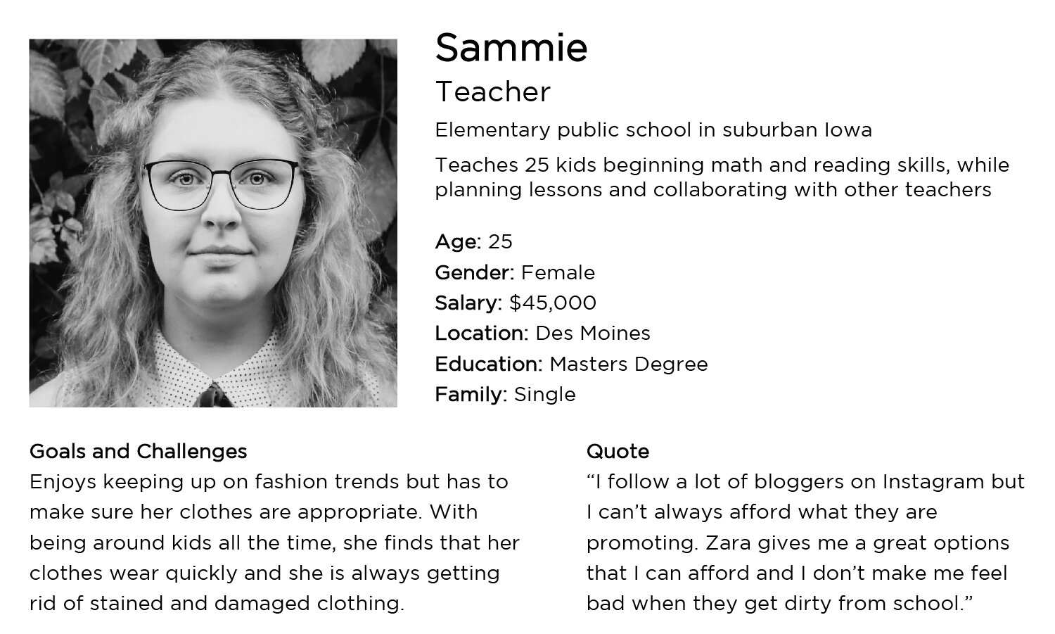
Based off of the results of the 20 surveys, I created these 3 personas to summarize my findings.
Journey Map
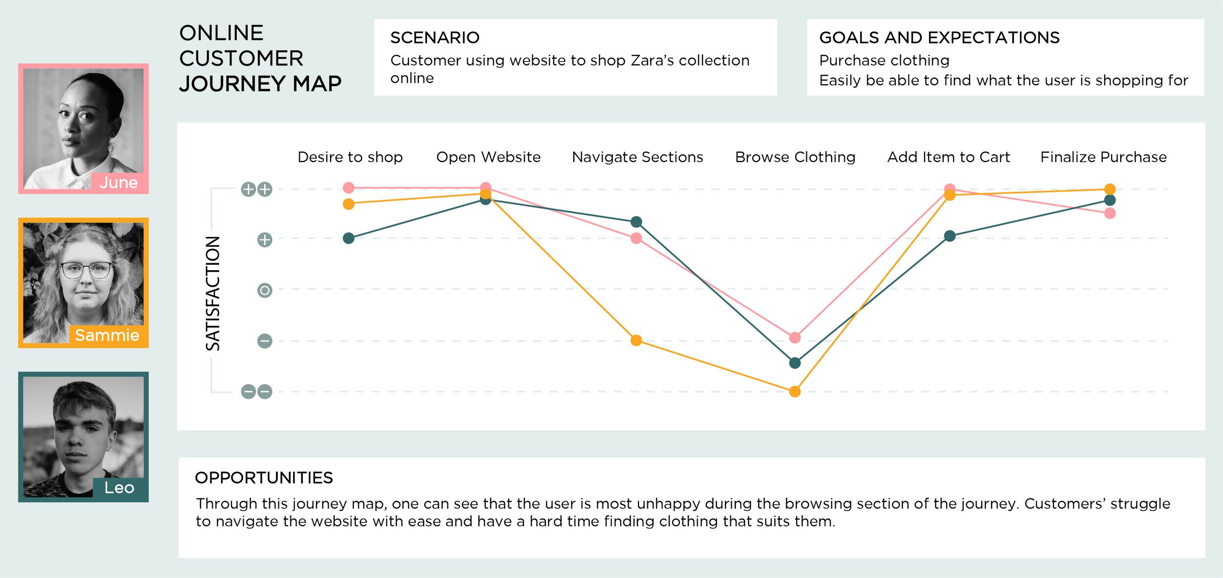
The journey map is based off of the journeys of the three personas created from the survey
Recommendations
Based off of the findings from the survey and interviews, personas and journey map I have recommendations of how Zara’s website user experience could be improved.
Show site navigation on the home page. Right now the only way to navigate to the section a user wants to shop in are some confusing arrows on the left and right side of the page or the stacked lines, symbol for a dropdown menu, in the upper left hand corner. Both types of navigation are not intuitive and do not tell the user where to go next in the site.
Add a breadcrumb trail. In order for the user to go backwards while using the website, they have to use the browser’s back button. There is no way for the user to return to the previous page with just using the navigation on the website. A breadcrumb trail would allow users to easily return to pervious pages or filters selected before.
Create a grid layout. Zara takes pride in its ability to give high fashion clothes at a reasonable price, but carrying this high fashion look into the purchasing process can cause confusion for the average user. When scrolling through the clothing items, one can see that there is no grid that is followed. All the photos are different sizes and shapes, plus spacing is inconsistent. A gridded layout would give the user more focus as they would easily be able to see the items for sale instead of being distracted by the overwhelming layout.
Design Solutions Mock-up
OLD
When first landing on the Zara home page, a user might be confused on where to go next with the only navigation shown though a small stack of lines in the top lefthand corner of the page.
By automatically showing the navigation and dropdown menu on the homepage without the user having to click anything, allows them to easily find the section they are looking to shop in.
OLD
OLD
Currently, when a user selects an item they are taken to a page that allows them to put the item in the shopping cart. The format is good, but the photos are too large. When on the page, a user can’t see the entire photo because how large it is. Once the user scrolls to see the entire photo, they will see there is actually multiple photos showing different aspects of the item.
In the new mock-up, the photos are smaller allowing users to see all of them easily on one page. This way no photo is missed and the customer knows exactly what they are getting.
NEW
NEW
When browsing for shirts and tops on the current Zara website, users see multiple photos of the same clothing item and all the photos are different sizes. With multiple of the same photos it is confusing to the user on which one to select. It also becomes very distracting that all of the images are different sizes and shapes.
In the new mock-up, all the items are only shown once. The photos are still showing Zara’s high fashion look, but the browsing process becomes a lot more standard with no multiples and the gridded layout.
NEW
Resources
Roll, M. (2019, December 17). The Secret of Zara's Success: A Culture of Customer Co-creation. Retrieved March 13, 2020, from https://martinroll.com/resources/articles/strategy/the-secret-of-zaras-success-a-culture-of-customer-co-creation/
Danziger, P. N. (2018, April 25). Why Zara Succeeds: It Focuses On Pulling People In, Not Pushing Product Out. Retrieved March 13, 2020, from https://www.forbes.com/sites/pamdanziger/2018/04/23/zaras-difference-pull-people-in-not-push-product-out/#aed80423cb7f


